Good morning! I’m excited to share my findings on some new products I’ve recently discovered! I’ve been watching Kristina Werner’s lettering videos with the watercolor line from Dr. Ph. Martin’s and I wanted to see them in person. The colors looked gorgeous in her videos and they definitely didn’t disappoint in person!
There are several watercolor lines from Dr. Ph. Martin’s but I focused on the radiant watercolors, hydrus watercolors, and bombay ink. Each line has several color sets but I bought the first color set of each type to try. Now I’m definitely not an expert on the various lines but here’s the basic info I discovered about each:
Radiant Watercolors
- 56 colors available individually or in 4 sets of 14
- not lightfast (meaning they will fade over time with exposure to direct sunlight)
- truly radiant brilliant colors
- can be used for watercoloring, lettering, airbrushing
- dye-based
- transparent
Hydrus Watercolors
- 36 colors available individually or in 3 sets of 12
- lightfast, archival grade
- bright colors but duller than the radiant watercolors
- can be used for watercoloring, lettering, airbrushing, dip pen calligraphy
- pigment-based
- transparent
Bombay India Ink
- 24 colors, available individually or in 2 sets of 12
- lightfast, archival grade
- bright colors, but slightly duller than the radiant watercolors
- can be used for watercoloring, lettering, airbrushing, dip pen calligraphy
- pigment-based
- transparent (except for black and white)
- non-spreading
- waterproof when dry
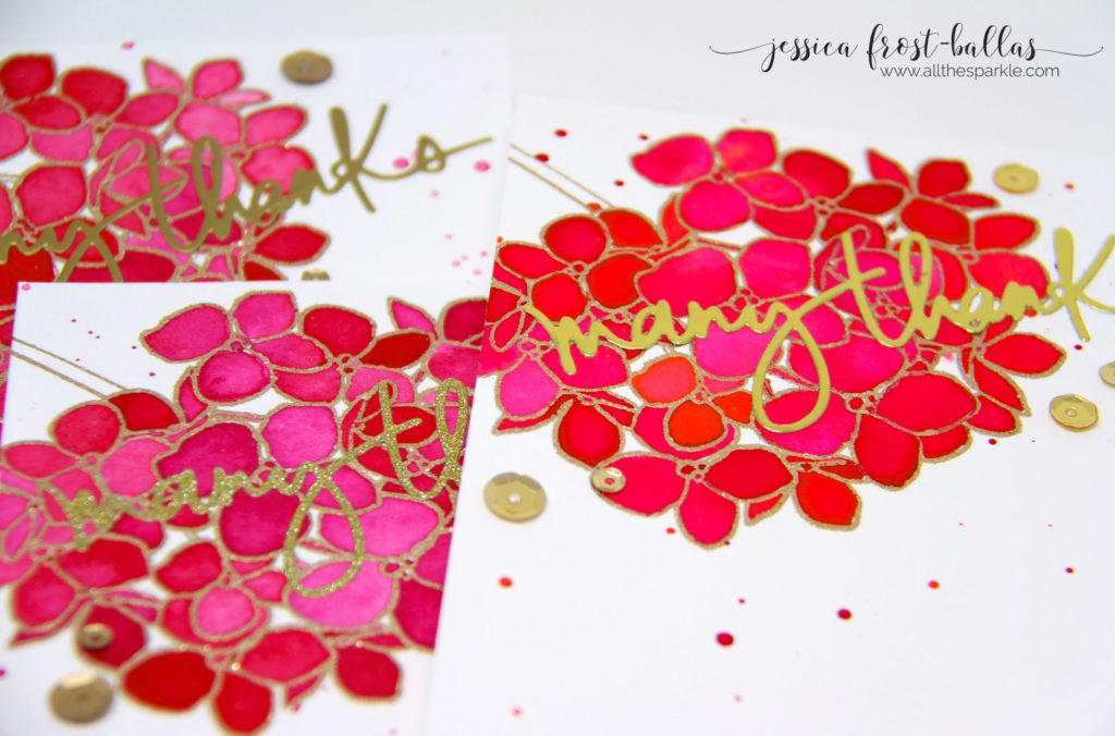
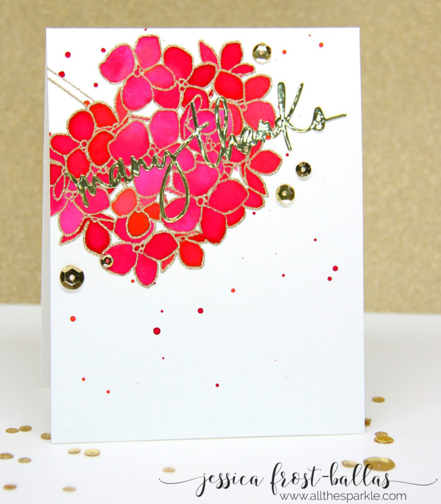
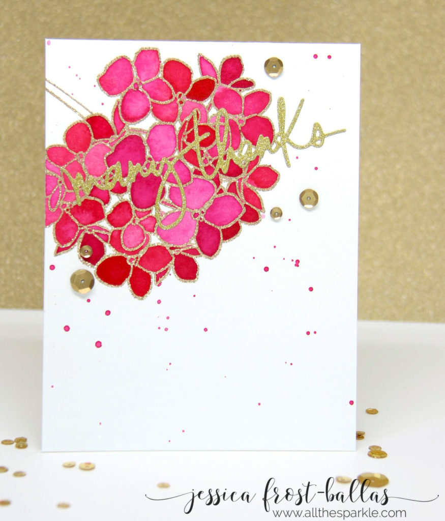
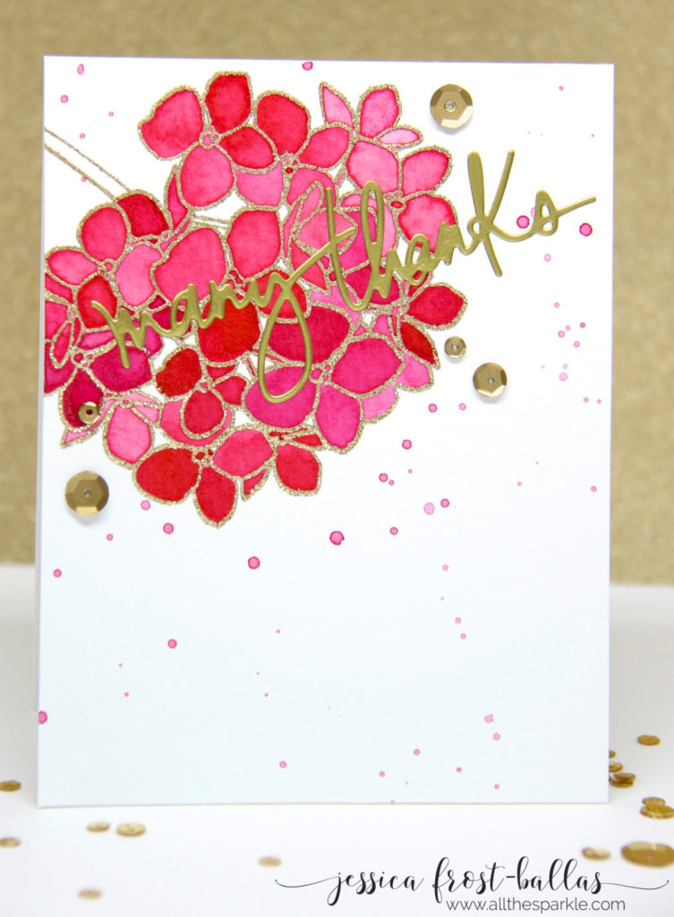
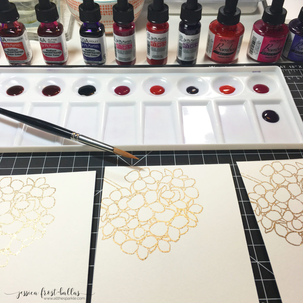
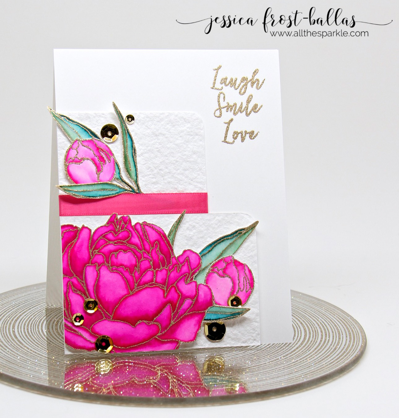
For my actual cards I followed the same process for each (obviously). I stamped the Mondo Hydrangea from Ellen Hutson in versamark on watercolor paper and heat-embossed it with gold tinsel embossing powder. I dropped each color into a paint palette and added a few drops of water to each color. Ignore the purple inks in the palette…I ended up not using that color for this project. For each card I only used two colors of paint, one pink and one red. I tried to pick color that were similar but you can definitely see the difference below between the dye-based radiant inks and the pigment-based hydrus and bombay inks.
With each card I applied paint in several different ways to experiment (which you can see from the individual photos above. For some petals of the hydrangea I applied the paint directly to the paper, for some I wet the petal first and then dropped in paint, and for some I mixed the two colors together. I also experimented with the amount of water I added to get lighter and darker shades. This resulted in a wide variety of petals which, to me, makes the hydrangea much more realistic as I’ve never seen a hydrangea where every petal is the exact same color. I let them dry naturally and then flicked paint over the cards. I noticed that the bombay ink splatters were much lighter and less concentrated than the radiant or hydrus splatters.
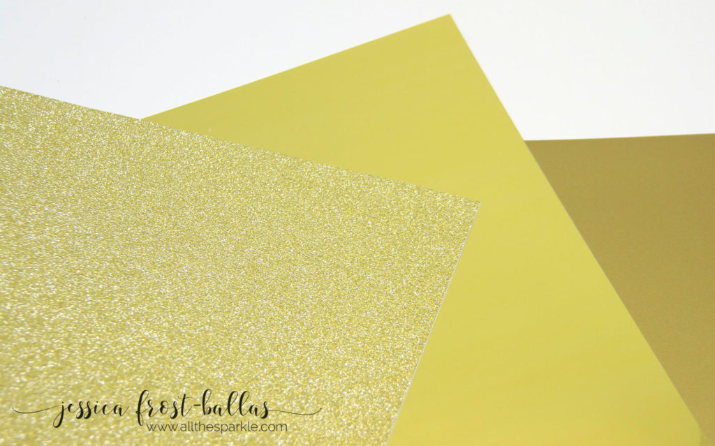
I wanted to keep the focus on the vivid hydrangeas so I didn’t go overboard with the sentiment. I decided that while I was testing paints I would also test some of the new adhesive papers from The Ton! Effie has recently added a huge variety of glitter, shimmer, matte shimmer, and foil papers and tapes to the shop and I was eager to try some of the gold papers! For my cards I die-cut the Ellen Hutson Many Thanks sentiment with gold foil paper, gold matte paper, and gold glitter paper. Since the paper is adhesive backed there’s no need for extra glue which I LOVE! On the first card I used gold foil paper, on the second card I used gold glitter paper, and for the third card I used gold matte paper. Finally I added medallion gold sequins to the first two cards and matte gold sequins to the third card. The matte paper perfectly matches the matte gold sequins which was a happy discovery!
So, my final thoughts on both sets of products?
I ADORE the radiant watercolors. The colors are FABULOUSLY vibrant and bright! I’m a little concerned about the lightfast issue but I also wonder how long it would take the colors to fade and how much direct sunlight is too much. For example, will the colors last if I make a card and mail it to a friend who keeps it for a few weeks on her desk and then throws it away? Or if a friend stashes the card away in a box for safe-keeping? To test the lightfastedness I painted a few swatches with the same two colors and have stored one in my cardbox, one out in my craft room but not in direct sun, and one in my craft room in direct sun. I took some photos and I’ll update this post in a month and in 3 months to let you know how they’re doing! 😉 I also liked the other two inks though the hydrus was not as vibrant as the bombay. The bombay definitely had a different feel to it when painting and it dried with a different texture than I’m used to (which must be due, in part, to the fact that it dries waterproof). The bombay is also non-spreading which made it a little harder to paint with…I added more water and you can see where I had to add water because it dried with a darker outline in the petal. A cool effect but not necessarily the one I was looking for. Overall, though, I’d most definitely recommend the radiant watercolors but if you’re concerned about them not being lightfast I would also recommend either of the other two. None of them were “fails” in any way!
And for the papers, again, a solid win all the way around! I LOVE the gold foil paper…it is absolutely stunning! It’s a little hard to photograph because it’s so shiny (you can practically see your reflection!) but it adds a gorgeous shine to your papercrafts! I was also surprised by how much I liked the matte gold. Normally I am ALL for sparkle but the matte gold was really elegant. If you scroll back up to the last photo you can see that the matte gold (upper left) has a totally different feel than the gold foil (right). And, of course, you can’t go wrong with glitter paper! The glitter doesn’t rub off which is always a plus and it really catches the light when you move the card. All three cut very easily with a die and my big shot and the adhesive is strong.
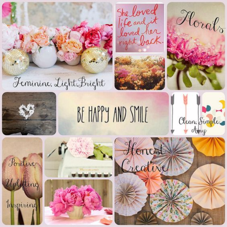
So unfortunately, if you’re looking to save money….this probably wasn’t the best post to read (ha!) but I hope that I was able to show you what each looks like so that you can decide which would work best for you! If you have any questions please feel free to ask and I’ll do my best to answer them! I’m also entering this card set in Ellen Hutson’s May Pin-Sights Challenge. Here’s the inspiration photo, I focused on the top left and right photos…the colors of the flower on the right and all that sparkly gold on the left!
Thanks so much for visiting (and for getting through this LONG post)! Have a wonderful day!
 Interested in the products I used? To make them easy for you to find, I have listed them below. (Affiliate disclosure can be found here). Your purchases help keep my blog running and I thank you for the support!)












Awesome post, thanks for all the wonderful info and your hydrangeas are stunning on your beautiful cards.
Great info! Thanks for suffering thru this test….ha!
Beautiful, vibrant cards!
Great post, thanks for the info!!!
Love the cards and appreciate you comparing these products. Your results are stunning! Downside? You are forcing me to get organized as I have all my “inks” thrown together and now I need to sort them out.
Great product review, Jessica! I’ve seen Kristina’s videos and often wondered about the inks and watercolors. The gold papers are pretty, too–love how they add the perfect touch of bling!
Incredibly pretty!
very eye catching. Love it.
Jess, thanks for the review, I have a much better understanding of the products and the true colors now. All my favs, pinks, golds and hydrangeas. TFSAAI.
Wonderful review! You’ve made me think I should really look into dye cuts – those are gorgeous! I am curious about how the lightfast experiment went with the Radiant watercolors. Did you ever post about that? I’d love to see “after” pictures!
Hi Hannah! I actually didn’t get a chance to do a follow up post with those exact cards because my mom stole those cards to give to her friend. Ha. However, I have used them since then and just went and found a card that I made in late June. It’s just as vibrant as it was the day I painted it! Definitely preferable to the zigs!
Awesome – thanks so much for the response Jessica!!
This was exactly what exactly what I was looking for…I’ve been reading all about the pros and cons of the radiant vs. hydrus watercolors, but seeing them side by side is exactly what I was needing. Thank you for doing this. Your cards are all stunning, but I think I “need” the radiant watercolors despite the fact that they may not last forever 🙂 For my cardmaking…that’s okay with me.
This was EXACTLY what I was looking for. I wanted to know the difference in the radiant vs hydrus watercolors. It was great to see how the bombay inks fit in. I am definitely passing this on to friends. I now have looked through other posts of you and I am hooked. Thank you again!
Did you ever update the lightsafeness?