Good morning! I’m continuing my study of the gorgeous background stamps from Simon Says Stamp! 😉 You can find two cards using the Emma background here. Today I focused on the Elizabeth background stamp and I love it just as much as the Emma! 😉
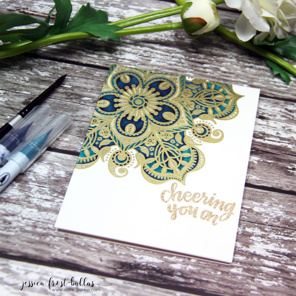
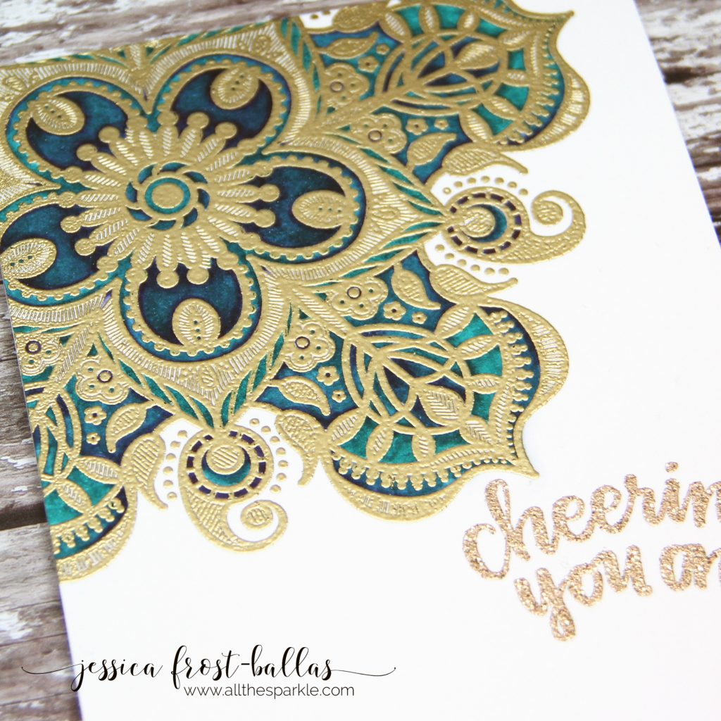
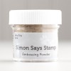
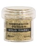
I decided that I wanted to experiment with very saturated watercolors in a peacock palette! I started by stamping the Elizabeth background with versamark and then heat-embossed it with gold embossing powder. Next I used my deep blue and persian green zig clean color real brush markers to add color to each segment and then blended it together with a damp paintbrush. In some areas I used a mix of both colors and in some areas I only used one. Varying the amount of water I used or the amount of each color helped to create different shades of blue green. I let it dry completely and then stamped the sentiment with versamark and heat-embossed it with gold tinsel embossing powder. If I did it again I’d probably use the same embossing powder for the sentiment and the background as the gold and gold tinsel are slightly different shades of gold. Oops… 😉
Seriously though…this stamp is just as gorgeous as the Emma background! Next up…the Elinor! 😉 Thanks so much for stopping by and have a wonderful Friday!

Interested in the products I used? To make them easy for you to find, I have listed them below. (Affiliate disclosure can be found here). Your purchases help keep my blog running and I thank you for the support!)


Beautiful card, love the vibrant color (and awesome coloring) and pretty stamp.
Jess this is so stunning, and the drama!!! Gorgeous! two colors? what an impact they’ve made.
I have a love/hate relationship with gold embossing powders. I also have a theory that the embossing buddy powders contaminate the container, which cause less-than-desired results over time – any thoughts? xx
=]
My first reaction was, WOW! I love the colors you used and embossing that gorgeous stamp in gold was perfect!!
This is lovely! Great colors and I love the sentiment! TFS!
Oh my… I love this
What a gorgeous card!
Just gorgeous! The rich blue green with gold is beautiful!
gorgeous card and i love love love that stamp! so pretty 🙂
Echoing the others: a pretty stamp elevated to a gorgeous image with your creativity! The gold and blue/green is stunning…
~carol
Such a beautiful card Jess! And I wouldn’t have noticed that the embossing powders were not the same had you not mentioned it.
Really nice! Thanks for sharing your technique! I had a similar situation with gold also. I think the person who created is the one who notices most.
Lovely card. I haven’t used this technique before. I certainly am inspired by you to try it. Thanks for sharing.
Omg this is so gorgeous! I love it! I’m usually too lazy to leave comments but I just had to with this one!
Really classy – I love the look and thank you for sharing!
WOW! I love your stunning card! So pretty!