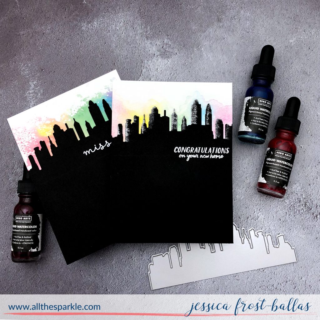
Good morning! I’ve been continuing to experiment with the new liquid watercolors from Hero Arts and today I wanted to share two fun and easy cards I created using two different watercolor techniques!
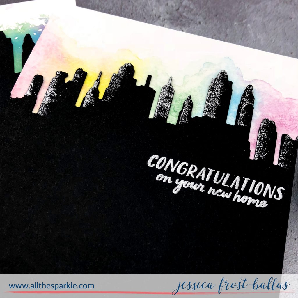
For the first congratulations card I dropped strawberry, dandelion, pine, indigo, and mulled wine liquid watercolors onto my craft mat. Then I wet a piece of watercolor paper and used a damp paintbrush to drop the colors onto the paper. I let them blend and blotted off the excess for a soft wash. I die-cut the skyline border from black cardstock and then swiped a versamark pad across the left side of each building before heat-embossing it with silver embossing powder. That swipe created a subtle metallic accent that almost looks like sun reflected on a skyscraper!
I stamped the sentiment onto the black cardstock and heat-embossed it with silver embossing powder to finish the card!
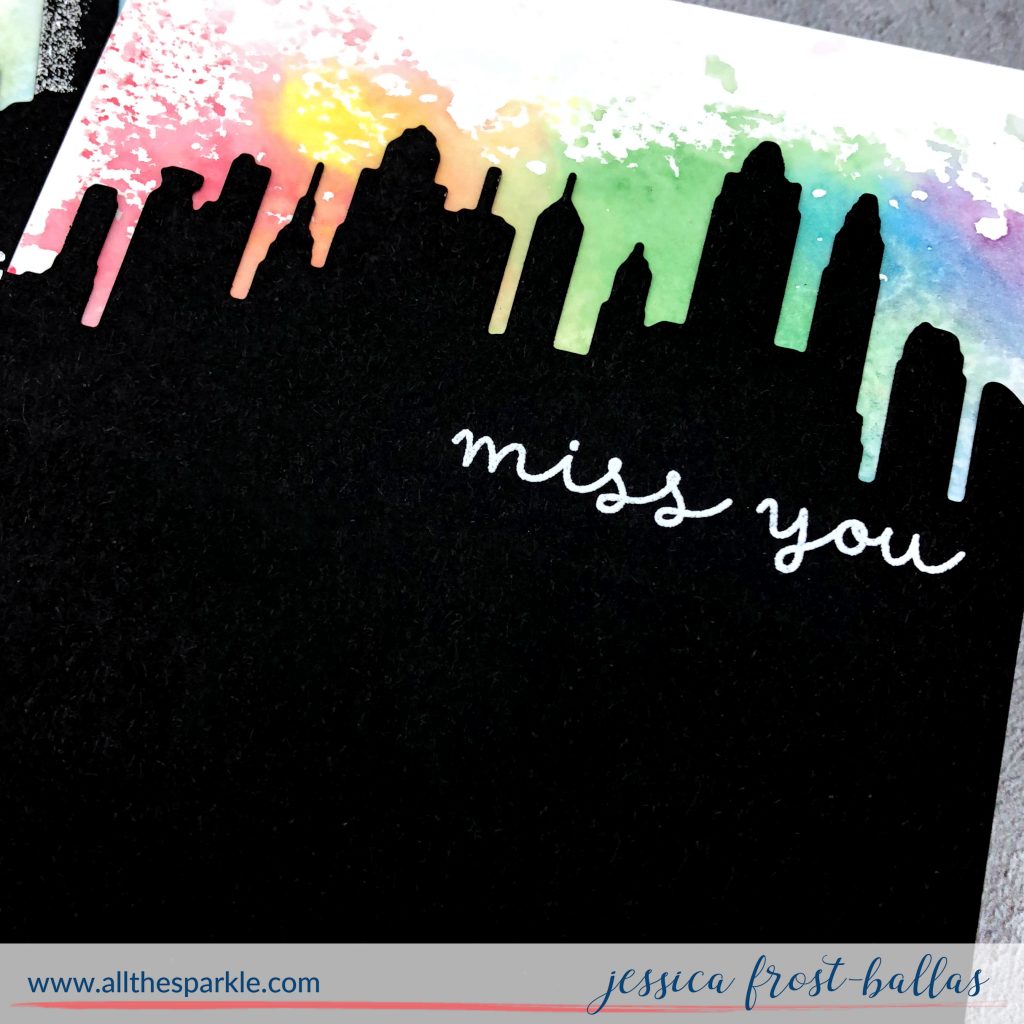
For my second card I used the same colors but this time I dropped liquid watercolors onto my craft mat and then spritzed them with a water bottle to dilute the colors. I picked up the watercolors by smooshing a piece of acetate into them and then pressing the acetate to a piece of watercolor paper. This resulted in a more vibrant but less blended look!
It wasn’t intentional but I love how that bright spot of dandelion liquid watercolors almost looks like the sun rising above the buildings! I blotted the excess watercolors off with a paper towel and then let it dry. I stamped the sentiment onto the black cardstock and heat-embossed it with white embossing powder.
I’d love to know which one you prefer! 😉 Personally I love the blended look but I think that’s because I really like how the embossing turned out on that one. I kinda wish I had embossed both of them now. Have you tried the liquid watercolors yet? What techniques have you used with them? 🙂
Thanks so much for stopping by and have a marvelous day!
 Interested in the products I used? To make them easy for you to find, I have listed them below. (Affiliate disclosure can be found here). Your purchases help keep my blog running at no additional cost to you and I thank you for the support!!)
|





Hard to say which I prefer. The brilliance of the silver reflection against the buildings or the sun rising over the rooftops of those skyscrapers…l just can’t pick one. Too much cleverness in one post.
Gorgeous!!
Love them both!
Both cards are gorgeous but I love the first one with the silver embossing on the buildings for the lighting, so cool! And love the yellow sun peeking through the pretty rainbow sky on the second one too.
I like the 2nd one! Both are pretty!
Beautiful cards! I really like the look of both cards, but I do love how you embossed the sides of the buildings 🙂
Both are gorgeous! Love the silver reflection on the first one but the more messy colors on the second one is so cool looking!