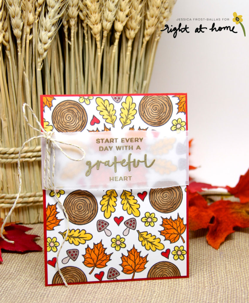
Good morning! Today I’m sharing a trio of cards featuring Grateful Heart as a member of the Right at Home design team! These cards were inspired by a variety of autumn color palettes! The first one is a more traditional palette of reds, oranges, yellows, and browns.
I wanted to create fun patterns using the shapes in the Grateful Heart set. I stamped the images with an acrylic block and didn’t get too fussy about a precise layout so it’s not perfect but you get the general idea. I stamped the images in a copic friendly ink and then went back and colored them. I trimmed down the panel and matted it to a dark red cardstock. Then I stamped the sentiment on vellum with versamark and heat-embossed it with gold embossing powder. I tore the vellum by hand to create a more natural look. I added a second layer of vellum behind the sentiment and adhered both layers to the back of the panel. Finally I added a little gold and kraft twine bow.
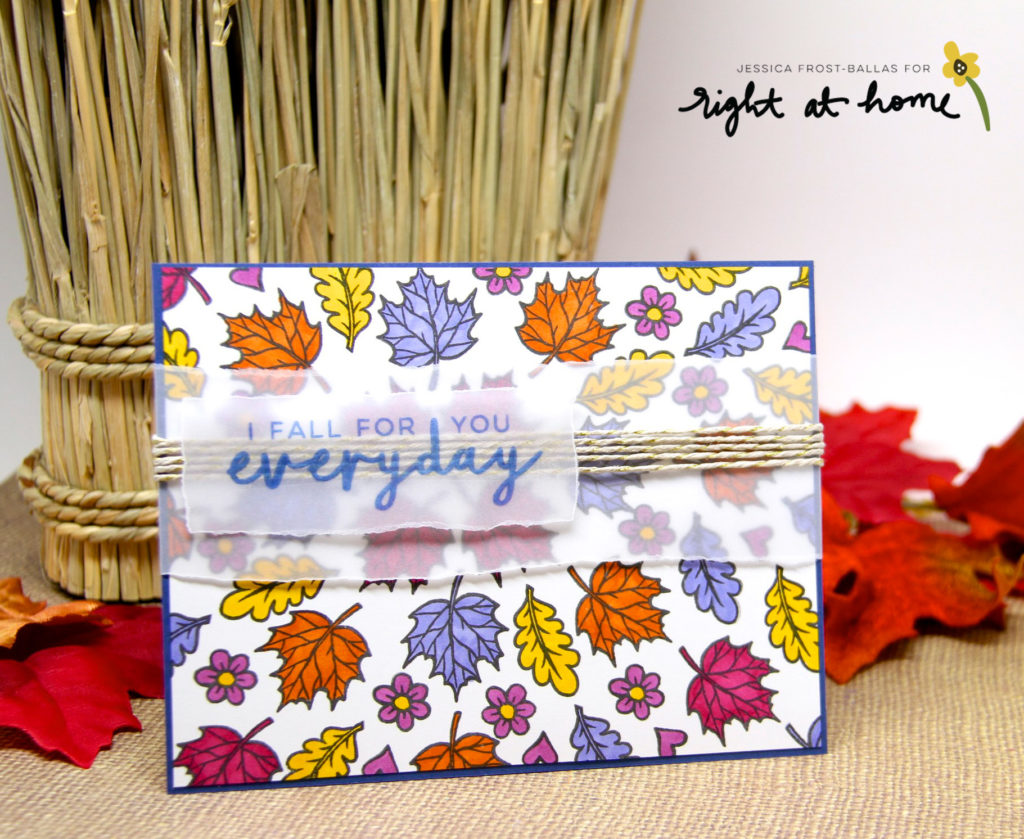
My next card uses rich purples, burgundys, and oranges and reminds me of my favorite fall scarf!
For this card I chose a point a little left of center and focused my pattern around the point. I followed the same process for this card but changed up the sentiment. I stamped the sentiment in a dark blue pigment ink and heat-embossed it with clear embossing powder. I added a layer of torn vellum and adhered it to the back of the panel. Next I wrapped the same kraft and gold twine around the vellum layer and secured it to the back. Finally I added the sentiment over the twine with a little vellum adhesive.
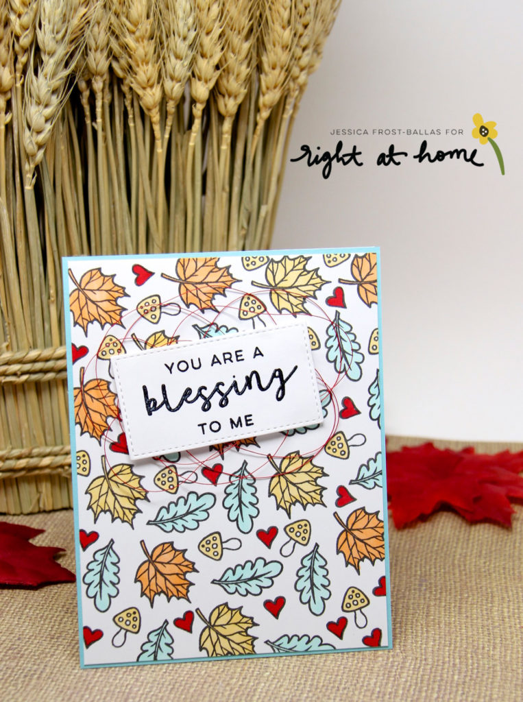
My last card uses a very unconventional autumn palette but I love the unexpected pop of aqua!
This card still reminds me of autumn but definitely not in the same way the others do…for this card I focused my pattern fanning out from the top left corner. After stamping the images from Grateful Heart and coloring them with copics I trimmed the panel and adhered it to aqua cardstock. Then I stamped the sentiment with versafine and heat-embossed it with clear embossing powder. I die-cut it with a stitched rectangle die and then adhered it to the card with foam mounting tape over a tangle of red thread.
These were really fun cards to create and honestly I could have kept coloring different combinations for days! For each palette I simply searched “autumn color palette” on pinterest, picked my top three, and then tried to match copic markers to each color as best as I could. You could easily do something similar with watercolors, zig markers, or colored pencils! I hope you’ll give it a try!
Thanks so much for visiting and have a wonderful day!



Hi Jess, beautiful! I love all the different colored palettes, great stamp set. Thanks for sharing and inspiring.
All three are very autumnal…and though I am a traditionalist by nature, have to say the last two cards appeal to me greatly. (Geez, that sentence sounds so prigish, ick!) Anyway, love each of the stamped backgrounds. That and your coloring is perfect. The touch of the twine provides a rustic, homey touch.
Gorgeous cards, I love all of the 3 colour combinations that you used! I also really like how you wrapped the twine around the second card behind the sentiment, I think that looks very cool.
Thinking the last one is my fave but love them all!
What gorgeous fall cards Jessica!